

iSportsman
Logo Design | Editorial Illustration | Publication Design
“Tara's quick turn around and adaptable style has made her a valuable resource to our company. We've relied on her for various projects, from creative minded magazine covers to practical tri-fold layouts, and she has always been receptive to feedback and professional in her approach.”
—Victoria Tillinghast, ASCIS Solutions
iSportsman provides program management solutions of recreational land usage for both commercial and government programs with a focus on conservation. I was asked to create a variety of designs to share awareness of the services iSportsman has to offer and to bring a fresh look to the brand.


Shooting My Shot


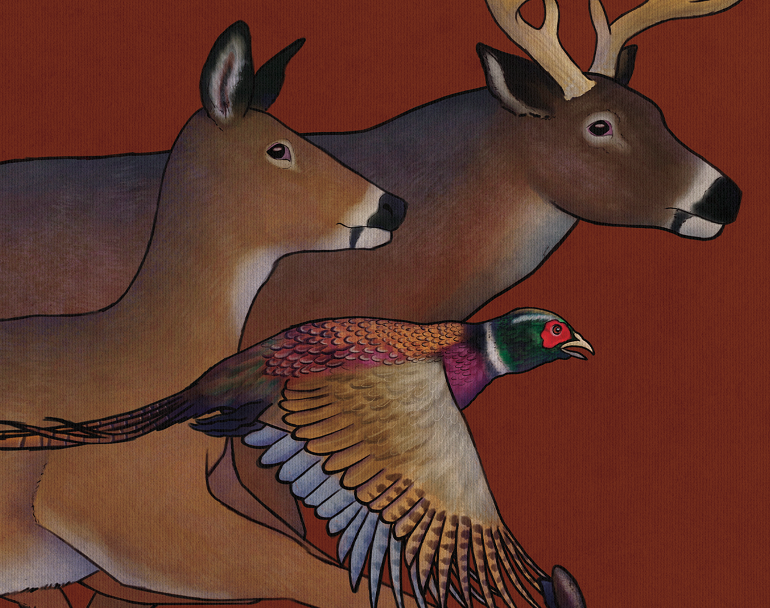
The cover was my first project for iSportsman. The theme for this year’s edition to their publication was a flashback to the 1930s. The original idea proposed by the client was to feature an outdoorsy woman in a classic pinup style. Following extensive visual research, I provided two different options with that theme in mind. For some variation, I also included a version featuring wild game. To my surprise, this idea was selected over the two that fit my client’s original vision.
Polishing the look


Not every rebrand needs to be a major change. Sometimes it just needs a little refresh. The typeface is an updated version of what was originally used in the old logo, with a few adjustments made to bring it out of the 2000’s and into the 2020’s. Additionally, I also got asked to create an additional logo for their new product line, iSportsman IS Outdoors, however this project did not end up being greenlit in the end. A lesson in learning that not all designs see the light of day.