

SweetFrog
Identity | Packaging | Marketing
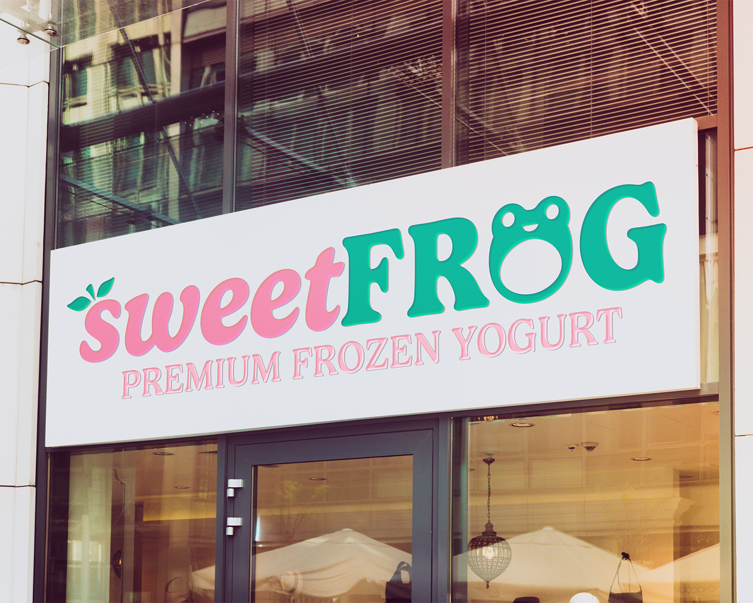
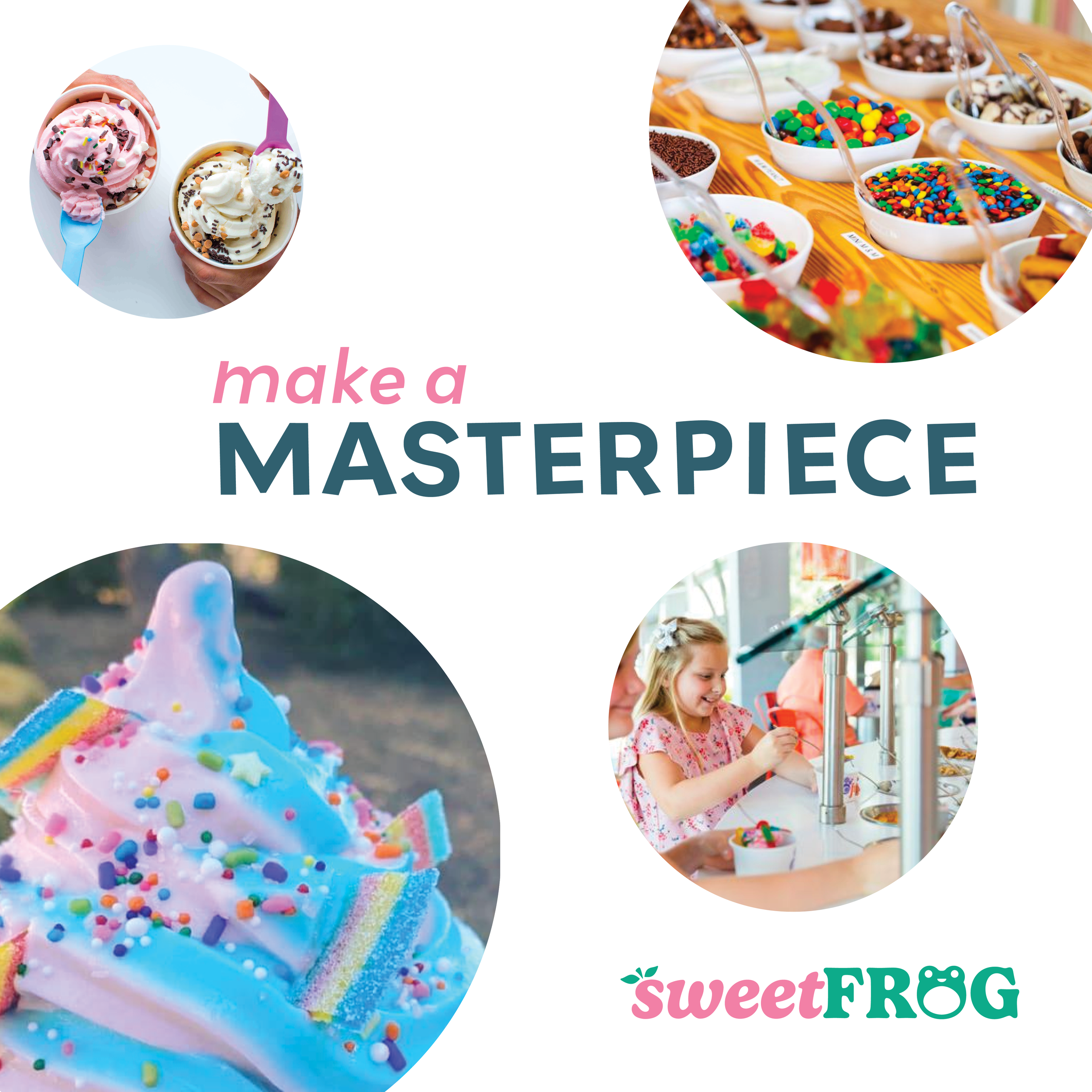
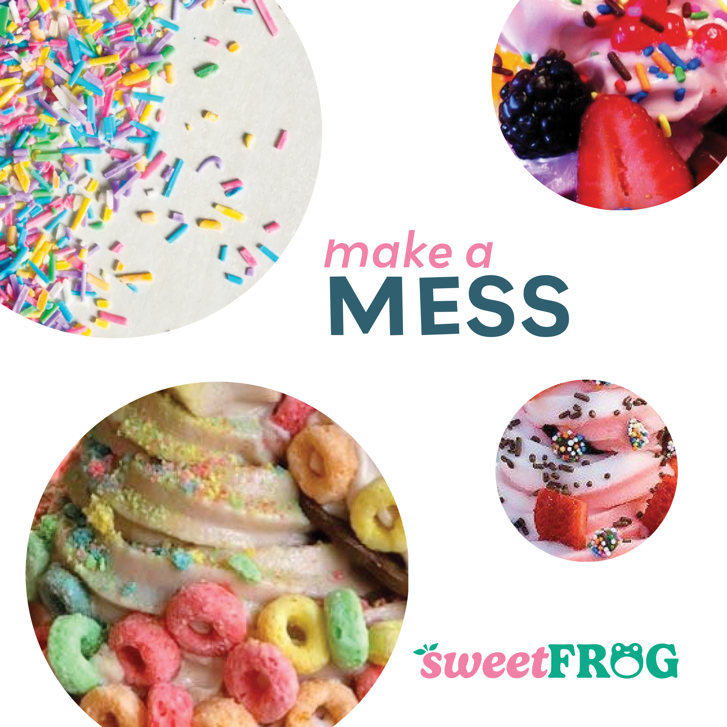
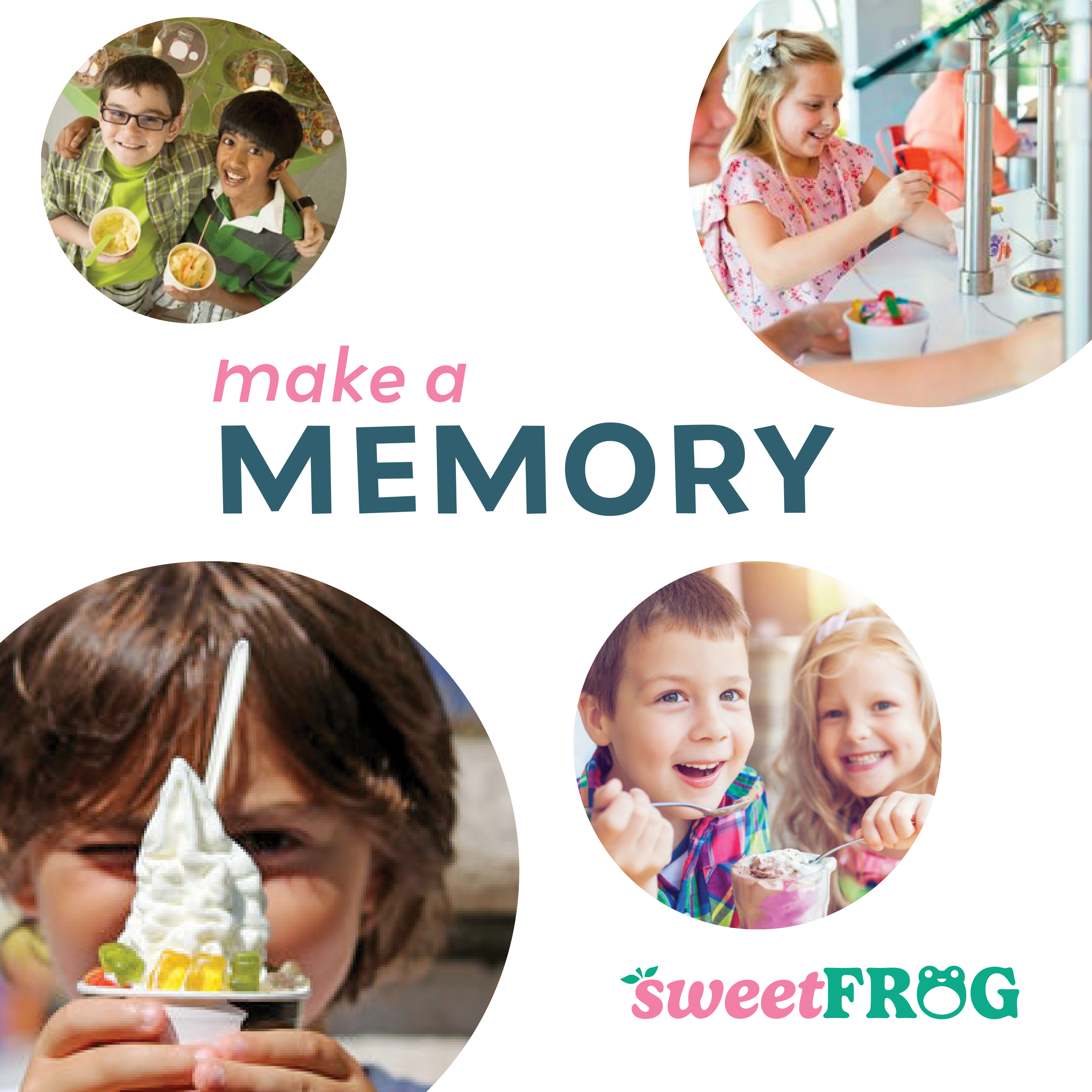
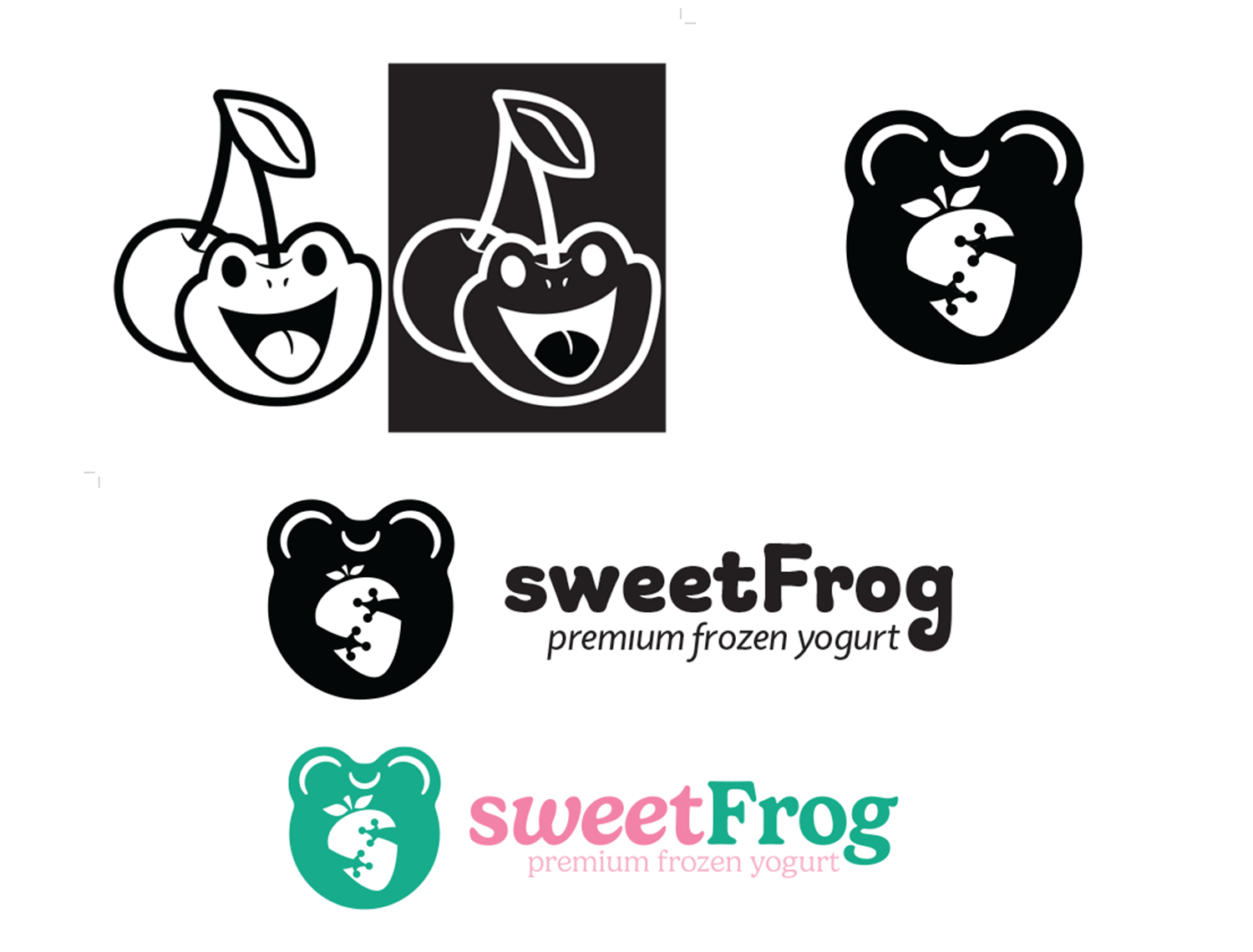
SweetFrog is a frozen yogurt shop that originated in Richmond, VA and has since spread across the rest of the country. My goal was to offer a fresh new look for them in a speculative rebrand.
More than a logo
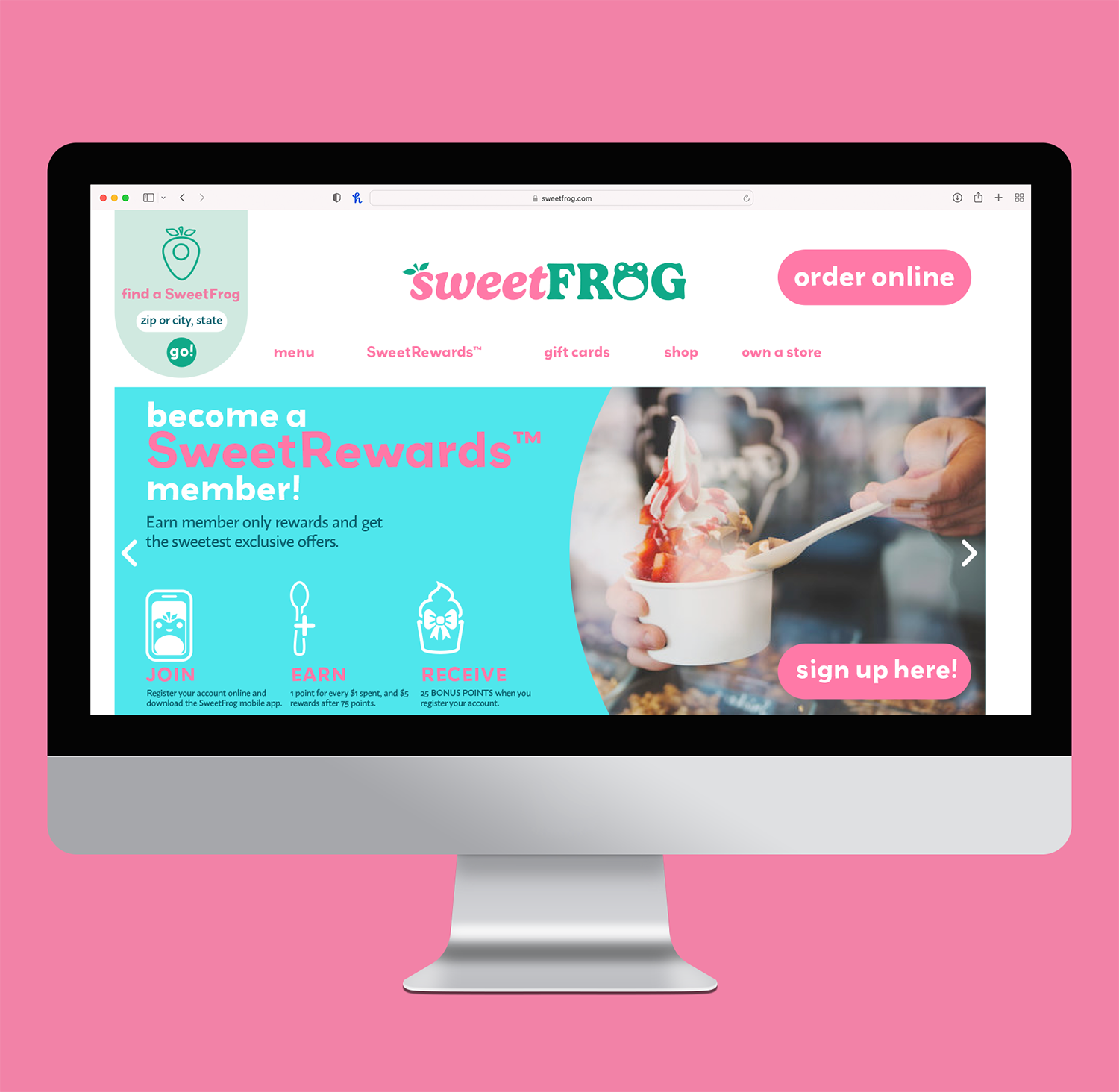
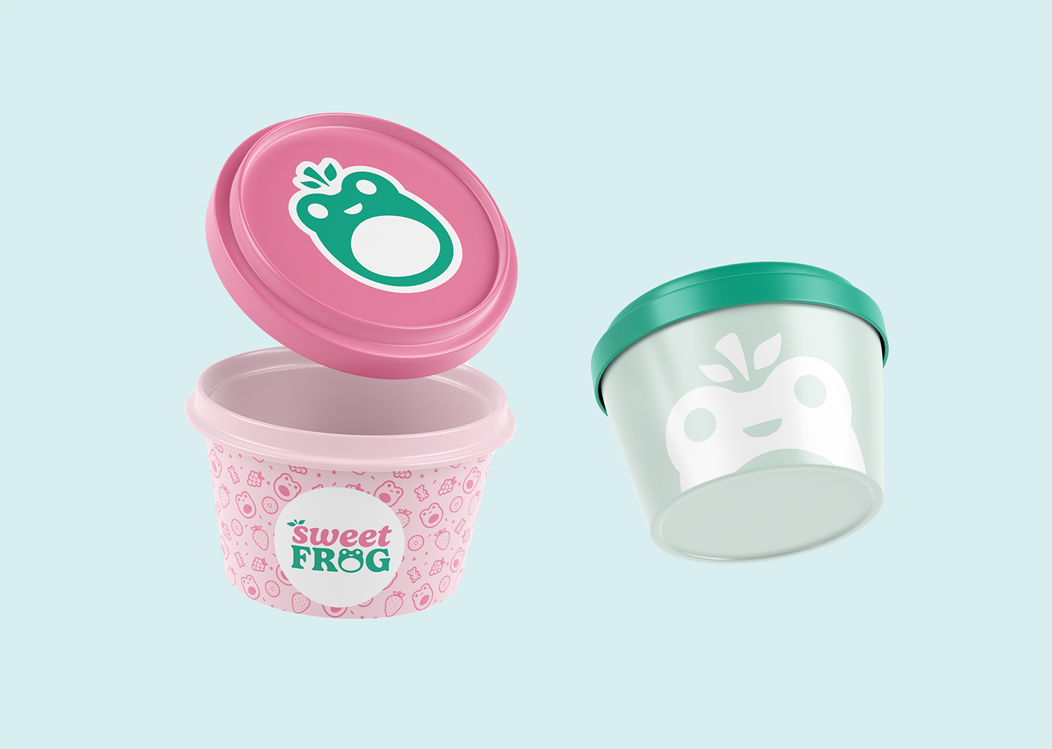
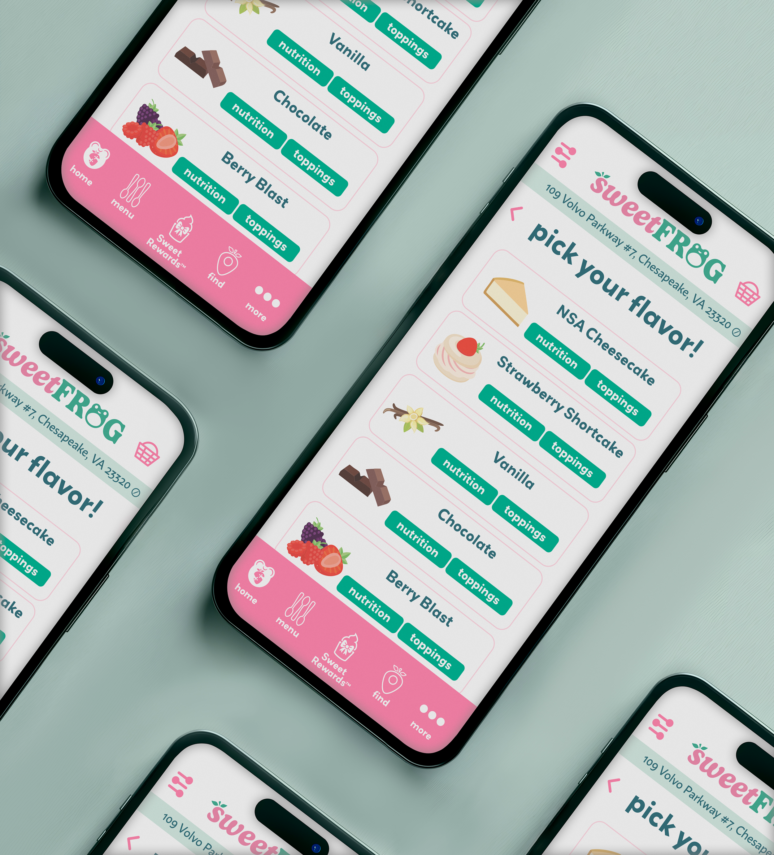
Creating a brand identity involves much more than creating a logo and finding some text to go with it. Its about the voice. With my interpretation of SweetFrog, I wanted this brand to feel whimsical and fresh. Branding is also about application and flexibility. I thought about all of the ways a brand utilizes their visuals, and how each of the chosen assets can meet the needs of the type of brand collateral.
The Taming of the Frog.
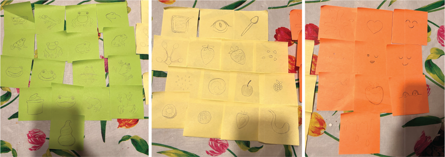
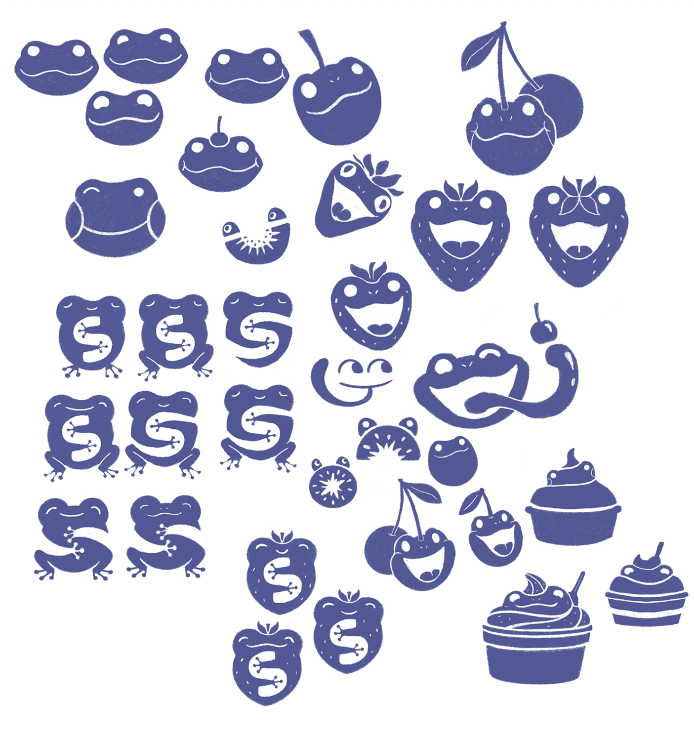
I started this project sketching out every possible thing associated with both frogs and frozen yogurt (and I still probably missed some.) This project was meant to push how we thought of branding, more than just a literal interpretation. I focused on the “sweet” aspect. A frog likely doesn’t taste sweet (seriously, don’t lick a frog) so I opted for a sweet demeanor. Some of my interpretations portray that better than others.
Each time I thought I had a “final” logo, I ended up being unhappy with it. This project was also a test of learning the difference between knowing when to keep working on something and knowing when it’s done. In this case, it became done over two years after the fact.